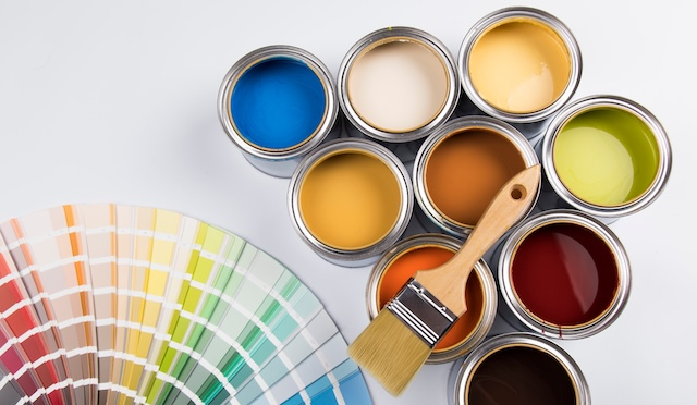
Choosing paint colors isn’t just about aesthetics—it’s about creating a space that feels inviting, balanced, and comfortable. The wrong shades can make a room feel cold, chaotic, or dated, while the right palette can instantly lift your mood and add warmth. Before you grab that vibrant swatch, let’s talk about the colors you should think twice about and the elegant alternatives that never go out of style.
Video: 100 House Painting Colours Outside 2024 | Exterior Wall Paint Color Combinations Ideas
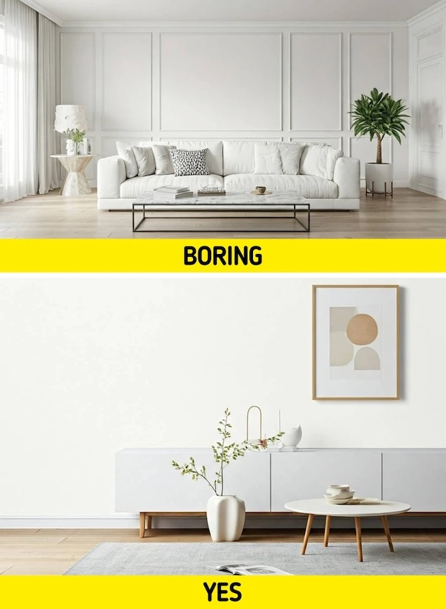
Stark White: When Clean Turns Clinical
White walls sound fresh and modern, right? But harsh, bright whites often give off a sterile, hospital-like vibe. They can expose every tiny wall imperfection and leave rooms feeling cold rather than cozy.
A Better Choice: Warm whites like Benjamin Moore’s White Dove or Sherwin Williams’ Alabaster. These soft, creamy tones keep the space airy without sacrificing warmth or comfort.
Neon Shades: Too Loud for Everyday Living
Neon pinks, electric blues, and fluorescent greens might feel fun for a party, but on your walls they quickly overwhelm. These colors are difficult to coordinate with furniture and create a space that feels more like an arcade than a sanctuary.
A Better Choice: Muted pastels—think blush pink, powder lavender, or pale mint. They offer personality and charm while keeping your home relaxed and inviting.
Overly Dark Hues: Making Small Rooms Feel Smaller
Deep blacks, navy blues, and charcoal grays bring drama, but in small rooms or spaces with little natural light, they can make walls feel like they’re closing in.
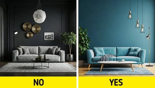
A Better Choice: Rich navy or deep charcoal with warm undertones. Use them sparingly—maybe on an accent wall—and pair them with light furniture to keep the space balanced.
Video: The Bedroom Paint Trick Nobody Told You About
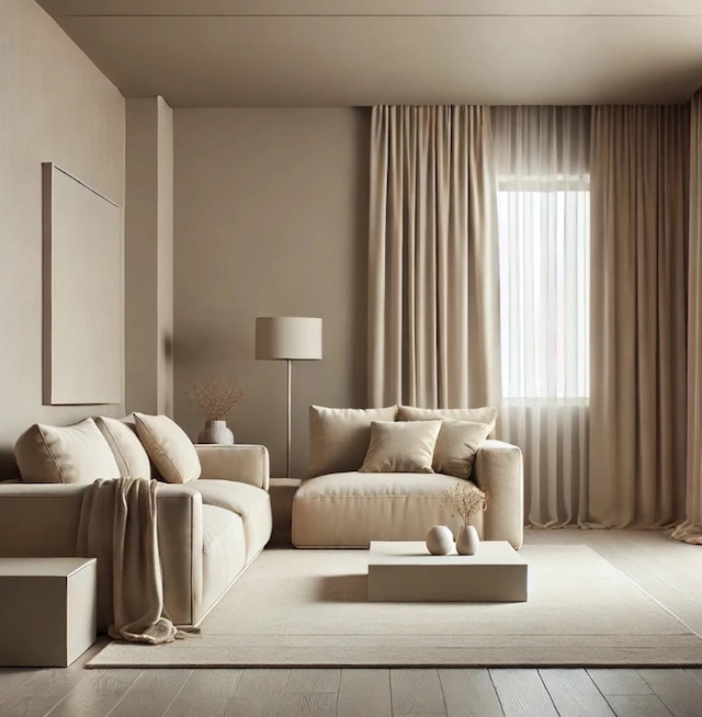
Heavy Browns: Outdated and Dull
Some brown tones can suck the energy out of a room. They absorb light and can make interiors look dated or even gloomy.
A Better Choice: Warm taupe or greige (a mix of gray and beige). These shades give you the cozy, earthy vibe of brown while keeping things fresh and modern.

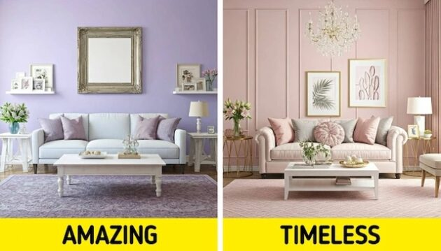
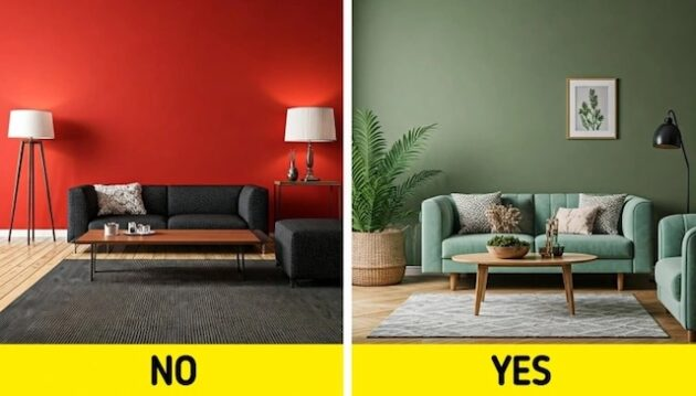
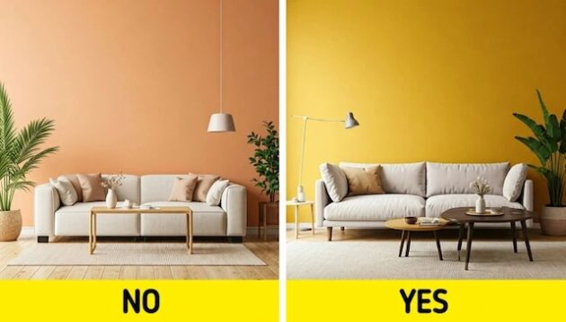
Bright Red: Overstimulating and Harsh
Red is bold and passionate, but splashing it across your living room or bedroom walls can feel intense and even stressful.
A Better Choice: Earthy terracotta, soft burgundy, or burnt orange. These shades bring warmth and energy without overpowering the senses.
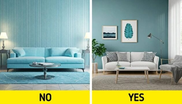
Icy Tones: Pretty but Too Chilly
Icy blue, stark gray, and mint green can strip a space of warmth, especially if there’s little sunlight. While they look modern, they often leave rooms feeling frosty and unwelcoming.
A Better Choice: Warm blues like powder blue or soft seafoam green. They keep things fresh yet cozy.
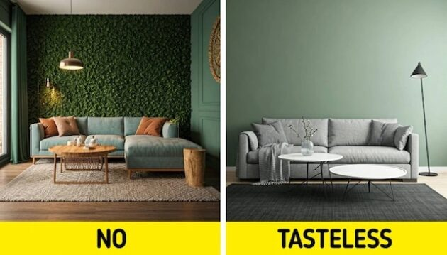
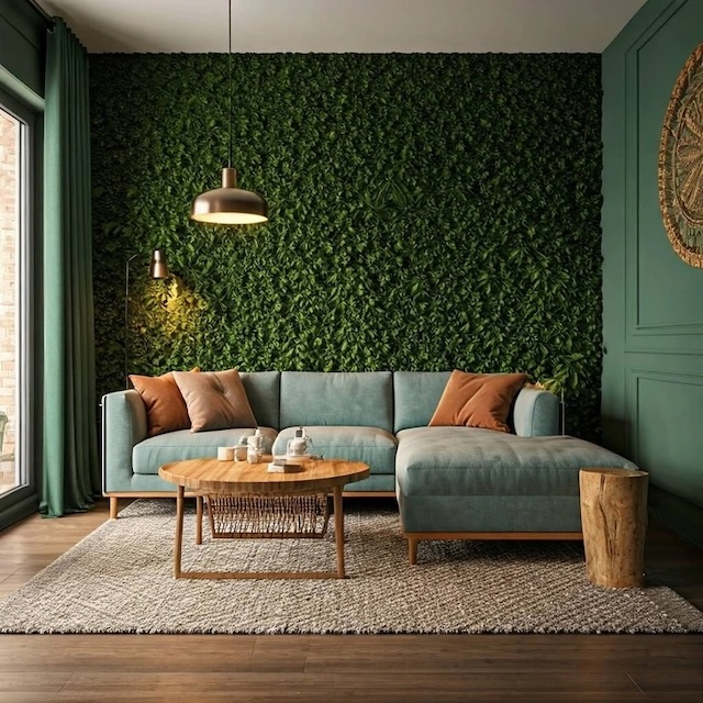
Saturated Brights: When Bold Becomes Too Much
Emerald green, royal purple, and canary yellow sound fun, but in large doses they’re overwhelming. They can compete with furniture and décor, creating visual chaos.
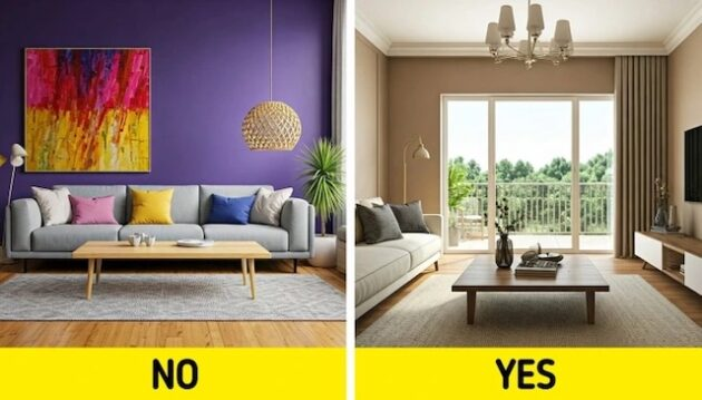
A Better Choice: Jewel tones in moderation. A deep teal or muted emerald used as an accent wall or in décor pieces can feel luxurious without dominating the space.
Video: Why Professional Painters Never Paint a Room This Way?
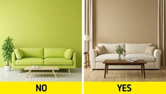
Lime Green: Fresh but Frantic
Lime green is lively but often clashes with furniture and throws a room off balance. Its intensity can create visual stress.
A Better Choice: Sage or olive green. These earthy hues bring calm, natural warmth and pair beautifully with wood and neutral accents.
Peach: Retro and Overused
Once a darling of interior design, peach now often feels stuck in the past. Over time it can look washed out and dated.
A Better Choice: Dusty rose or warm apricot. These shades keep the gentle warmth of peach but add a modern, sophisticated twist.
Trend-Driven Colors: Fast to Fade
Colors that explode on social media—like millennial pink or ultra-violet—can quickly feel outdated. What’s hot today may be gone tomorrow, leaving your home looking stuck in last year’s trend.
A Better Choice: Timeless neutrals like soft grays, classic whites, and subtle earth tones. Use trendy colors in small accents like pillows or art so you can swap them out easily.
Monotone Madness: When Consistency Turns Boring
Painting every room the same bold shade might seem cohesive, but it can make your home feel flat and lifeless.
A Better Choice: Complementary color palettes. Mix tones from the same family or add an accent wall to create layers of visual interest without overwhelming the senses.
Picking paint colors is about more than style—it’s about creating a mood that fits your life. Skip the harsh whites, neon brights, and fad-driven tones. Instead, lean into warm neutrals, soft pastels, and balanced jewel tones. With the right palette, your home will feel both timeless and welcoming, a place you’ll love for years to come.